There’s a lot of books out there on data visualisation – from collections of luscious graphics, to practical how-to guides and specialist texts. We thought we’d show you what’s on our bookshelf, and what we’d like to add.
Hopefully you find something you’d like to add to your own collection!
The classics
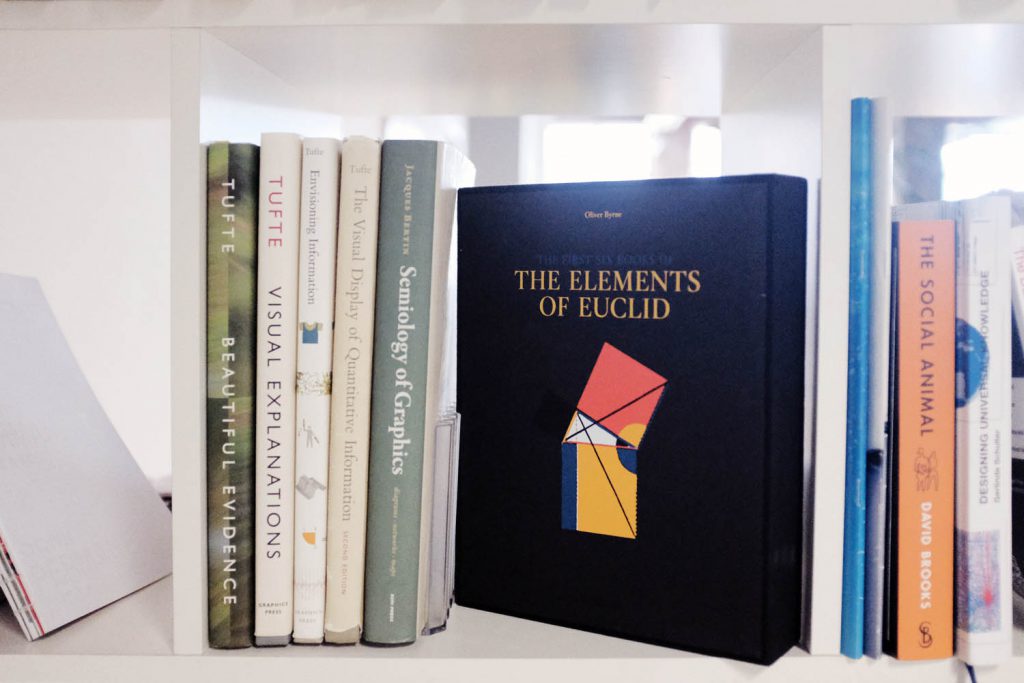
Tufte books
- Envisioning information, Graphics Press, 1990
- Visual Explanations: Images and Quantities, Evidence and Narrative, Graphics Press, 1997
- The Visual Display of Quantitative Information, Graphics Press, 2001
- Beautiful Evidence, Graphics Press, 2006
Data visualisation pioneer Edward Tufte’s key concepts – including data-ink ratio (how much data is presented vs. the amount of ink or pixels used to display it), chartjunk, and the lie factor (basically, how closely the magnitude of something in a graph reflects the magnitude of the same thing in the data) are as relevant today as ever. His books break down different graphing principles and graph types, and many of his observations and preferred charting methods are now canonical.
- Jacques Bertin, Semiology of Graphics: Diagrams, Networks, Maps, Esri Press, 2010 (first French edition 1967)
French cartographer Jaques Bertin first published Sémiologie Graphique in 1967, and it’s one of the foundational books of information visualisation. It was recently republished by Esri Press in California. It’s heavy on cartographic principles, but covers different diagram types as well, breaking them into fundamental properties such as volume, size, shape, orientation, colour and texture.
- The Elements of Euclid, Taschen, 2010 (first published c. 300BC)
Euclid doesn’t have a Twitter profile, but that doesn’t mean the ancient Greek mathematician doesn’t cast a long shadow. Irish mathematician Oliver Byrne published a coloured version of Elements in 1847, in a clear and modern style which prefigures the Bauhaus and De Stijl aesthetics, and Tufte refers to this work in his books. Apart from being a graphic inspiration, the principles of geometry and proportion which underlie Euclid’s work are still the fundamental building blocks of information visualisation today.
Coffee table books and beautiful collections

Manuel Lima books
- Visual Complexity: Mapping Patterns of Information, Princeton Architectural Press, 2011
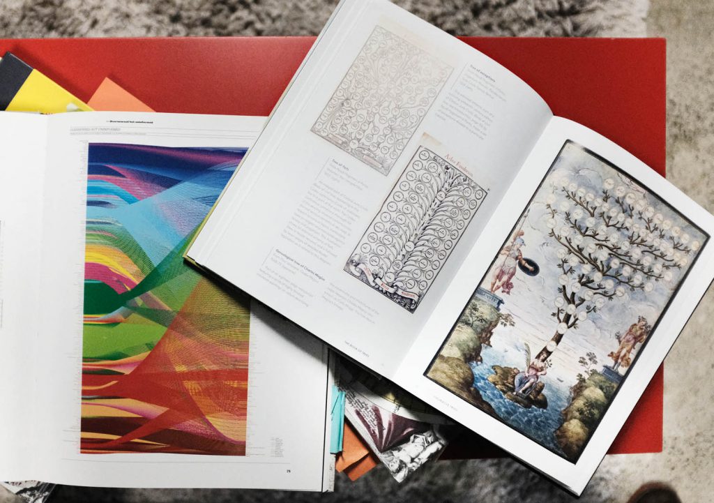
- The Book of Trees: Visualising Branches of Knowledge, Princeton Architectural Press, 2014
- The Book of Circles: Visualising Spheres of Knowledge, Princeton Architectural Press, 2017
Manuel Lima has published three wonderful books since 2011, covering different types of data visualisation – Visual Complexity (network diagrams), The Book of Trees (treemaps, dendrograms, family trees and all things tree), and the Book of Circles (all kinds of circular graphs). All of these books trace the history of these graph types, their reasons for being, and include a stunning variety of examples that keep you coming back to the books again and again.
- Data Flow, ed. Robert Klanten, Nicolas Bourquin, Thibaud Tissot and Sven Ehmann, Gestalten, 2008
- Data Flow 2, ed. Robert Klanten, Nicolas Bourquin, Thibaud Tissot and Sven Ehmann, Gestalten, 2010
The Data Flow books, published by graphic publishing house Gestalten, are usually sitting on the coffee table in our lounge area. There’s such a huge variety of big, colourful visualisations and infographics in here, it’s impossible not to be inspired by something as you leaf through them.
Maybe we should get…
- Photoviz: Visualizing Information through Photography, ed. Nicholas Feltron, Sven Ehmann and Robert Klanten, Gestalten, 2016
- Juuso Koponen and Jonatan Hildén, Data Visualization Handbook, Aalto University Press, 2019
Photoviz, edited by Nicolas Feltron, is an interesting take on using photography for data visualisation. Juuso Koponen and Jonatan Hildén’s Data Visualization Handbook has been described as something like the love child of a coffee table book and a textbook, and it does look lovely (and packed with information). It has to be ordered from Europe currently.
Mapping books
We do a lot of work with mapping, from transport infrastructure to mapping the diversity of Sydney for SBS and everything in between, so it’s good to have some inspiration on hand.

- Jelte Boeijenga and Jeroen Mensink, Vinex Atlas, maps by Joost Grootens, Uitgeverij 010 Publishers, 2008
This work maps the so called “Vinex” disctricts of the Netherlands, the new housing areas constructed on the recommendation of the Dutch Government’s now (in)famous “Fourth Report on Spatial Planning” (Vierde Nota over de Ruimtelijke Ordening Extra). It’s a rather specialised work, but well worth looking at for the crystal clear maps designed by Joost Grootens, which augment traditional atlas conventions with infographics, statistics and photographs, all in a beautiful but restrained colour scheme of his own devising.
- A Map of the World: The World According to Illustrators and Storytellers, ed. Antonis Antoniou, Gestalten, 2013
Leafing through this book is like wandering through a fantasy world, except that it’s our own earth, drawn and reimagined in wonderful ways. It’s definitely more on the infographics side of things, but still full of inspirations for data visualisation.
- Mind, Maps and Infographics, Moleskine, 2017
This book is “about projects by cartographers, graphic designers, architects, choreographers, artists and explorers”, a kind of interdisciplinary exploration around the topic of mapping. It’s an interesting mashup of work that includes well known data visualisation designers like Nicholas Feltron, musings on the similarities between data visualisation and abstract art by Giorgia Lupi of Dear Data, and points where art and data collide, like the weather sculptures of Nathalie Miebach.
From bloggers
These people have been collating interesting information online for many years, and have summarised that store of wisdom into books for all of us who like pretty objects on bookshelves.

Nathan Yau books
- Visualise This: The FlowingData Guide to Design, Visualization, and Statistics, Wiley, 2011
- Data Points: Visualization That Means Something, Wiley, 2013
Nathan Yau has been blogging about data visualisation on flowingdata.com since 2007. Visualise This is an all-in-one data visualisation introduction, covering everything from visualisation design to tools, processing data, and ‘what to look for’ in various data types, from spatial relations to time-based data. We should also get the companion book, Data Points: Visualization That Means Something. It’s more focused on the ‘thinking process that helps you create original, meaningful visualisations that your audience will both understand and remember.’
Maybe we should get…
- Andy Kirk, Data Visualisation, a Handbook for Data Driven Design, Sage publications, 2016 (Revised second edition 2019)
Andy Kirk has been writing at visualisingdata.com since 2010. The focus of this book is the “practice of a visualisation design process”, the practical steps and thought processes that Kirk goes through in the course of making data visualisations. Says Kirk “the path to mastering data visualisation is achieved by making better decisions: effective choices, efficiently made.”
- Cole Nussbaumer Knaflic, Storytelling With Data, Wiley, 2015
I listened to this as an audiobook, believe it or not. It came with an accompanying PDF, but the descriptions were good and the graph types were very standard, so I never even looked at the pictures. It’s not an artsy graph book, it’s very much focused on communicating a clear message in a business context, but there are good points in here around how to convince an audience with data and ‘bring them along with you’ via storytelling, in contexts such as giving a presentation or preparing a report. Knaflic writes at storytellingwithdata.com.
- Stephen Few, Show Me The Numbers, Analytics Press, 2012
Like Cole Nussbaumer Knaflic’s book, this is a practical guide to data visualisation in a business context. It’s an actionable guide to how to communicate clearly with data and how ‘not to make bad graphs’. Few writes at perceptualedge.com.
Alberto Cairo books
Cairo’s blog thefunctionalart.com is full of well written, insightful thoughts on data vis and recent books and trends, and his books are the same. He’s also got a new book coming out in October this year, How Charts Lie.
- The Functional Art, New Riders, 2012
- The Truthful Art: Data, Charts, and Maps for Communication, New Riders, 2016
- How Charts Lie, coming out October 2019

Maeda Books
A software engineer who went on to be an artist and designer, Maeda’s mission is to unite creativity and code. He’s currently Global Head of Design at Automattic (the parent company of WordPress), and among other jobs spent 12 years as a professor at the MIT Media Lab, where one of his students was Ben Fry (the co-creator of Processing with Casey Reas). Processing itself grew out of a project called ‘Design By Numbers’, led by Maeda at MIT, and Fry and Reas both contributed to his 2004 book ‘Creative Code’.
- Maeda@Media (with a foreword by Nicholas Negroponte) Thames & Hudson, 2000
- Creative Code, Thames & Hudson, London, 2004
- The Laws of Simplicity: Design, Technology, Business, Life, MIT Press, 2006
Creative Code includes work by the Aesthetics + Computation Group that Maeda directed at MIT, and each section includes essays. The Laws of Simplicity summarises some of Maeda’s main thoughts on design (though he claims to be in the process of reworking them)
Project books
Sometimes visualisations are like one-liners, other times they’re so involved that they deserve their own book. These are some of the latter.
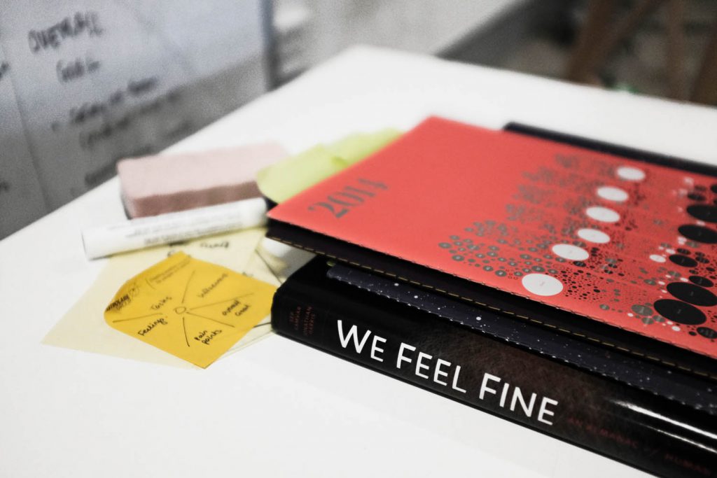
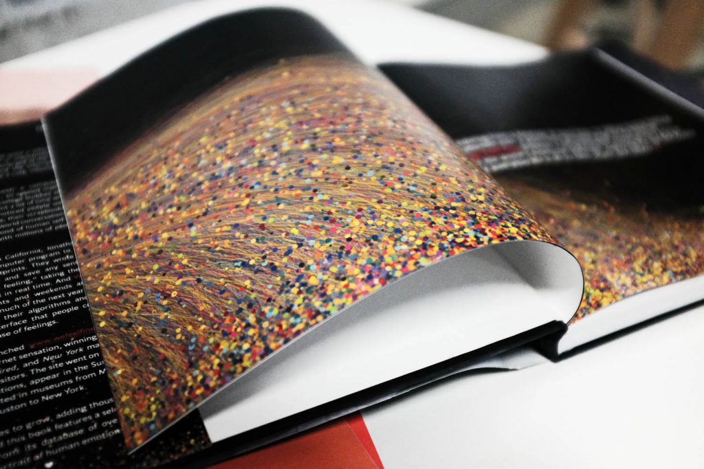
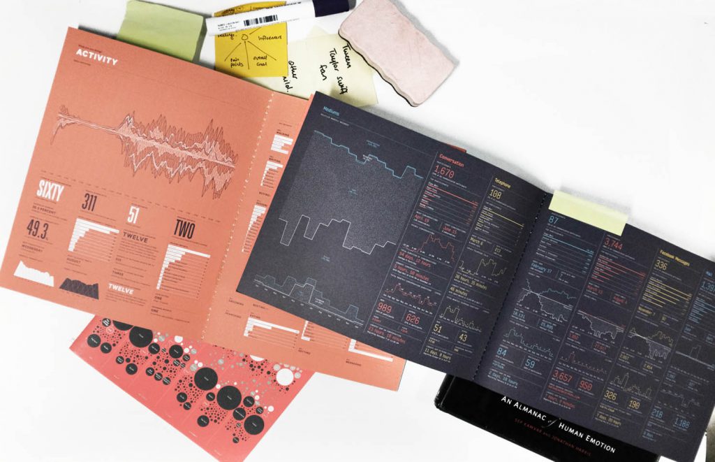
- Sep Kamvar and Jonathan Harris, We Feel Fine: An Almanac of Human Emotion, Scribner, 2009
Remember when emotions on the internet were a thing of curiosity and beauty, rather than a valuable resource for advertisers? It seems hard to get a browser to run this app these days, but regardless it is (was?) a landmark piece of data visualisation that’s now being taught in universities around the world. The website scraped a variety of blog platforms every 10 minutes and searched for sentences containing “I feel” and “I am feeling”. It then matched the other content those sentences against a large dictionary of “feeling” words, and if it found one, tried to scrape the profile data of the author as well for context. What was the weather like at the author’s location at the time, for example? The app itself was a beautiful, sprawling, (mostly) bubble chart based visualisation made in Processing, like a colourful sea of feelings in real time. It that could be broken down by many different criteria and allowed people to navigate in to the specific content pieces.
- Feltron Reports, 2005-2014
Nicholas Feltron’s annual reports, published over ten years from 2005 to 2014, are groundbreaking examples of what’s now called ‘Quantified Self’. Back when he started there was nothing like Strava or the Apple Health app, and the idea that internet companies might be interested in personal user data hadn’t really reached the public consciousness. Tracking everything from his sleep habits to his coffee consumption, Feltron’s reports epitomise the idea of self knowledge through self tracking.
Dear Data
- Dear Data, Princeton Architectural Press, 2016
- Observe, Collect, Draw, Princeton Architectural Press, 2018
@stefpos
@giorgialupi
@_deardata
Dear Data represents 52 weeks of personal correspondence between Giorgia Lupi and Stefanie Posavec, during which they mailed hand-drawn personal data to each other on postcards. They like to call it “personal documentary” as opposed to “quantified-self”, emphasising the human and expressive quality of the data as opposed to its functionality. Their second book extends their methodology to the reader with practical activities, inviting us all to observe, collect and draw the personal data of our lives.
Histories of Data Visualisation
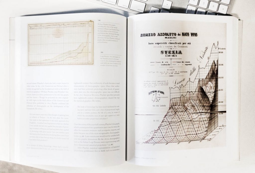
Everyone knows Minard’s famous map of the Napoleonic invasion of Russia, and John Snow’s mapping of cholera outbreaks in London, but there are so many more rich examples in the history of data visualisation. One that we love is:
- Daniel Rosenberg and Anthony Grafton, Cartographies of Time, A History of the Timeline, Princeton Architectural Press, 2010
Maybe we should get…
- Sandra Rendgen, History of Information Graphics, Taschen, 2019
This book is available for pre-order, and it looks amazing. It will be out on June 27.
Infographics
We do more work involving programmatically generated data visualisations, but there’s so such creativity and variety in infographics. Here’s a few of the books we always have to hand in the office:
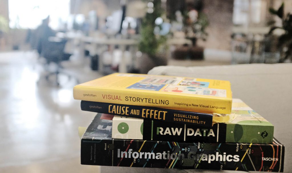
- Visual Storytelling: Inspiring a New Visual Language, ed. Robert Klanten, Sven Ehmann, Floyd Schulze, Gestalten, 2011
- Cause and Effect: Visualizing Sustainability, ed. Stephan Bohle & Robert Klanten, Gestalten, 2012
- Steven Heller & Rick Landers, Raw Data: Infographic Designer’ Sketchbooks, Thames & Hudson, 2014
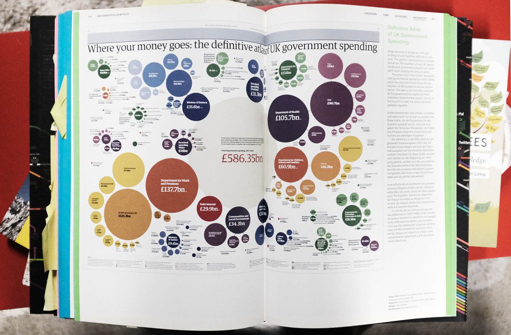
- Information Graphics, ed. Sandra Rendgren, Taschen, 2012
Creative coding books
- Daniel Shiffman, The Nature of Code, 2012
If you don’t know Daniel Schiffman, just look up “Coding train intro video” on YouTube. You’re welcome. The Nature of Code is a well known book in the world of Processing, dealing with how to model natural systems.
Maybe we should get…
- Julia Steele & Noah Iliinsky, Beautiful Visualization, O’Reilly Media, 2010
In keeping with O’Reilly’s tradition of great ‘How-to’ books, this is a practical introduction to data visualisation in multiple areas. There are some code examples, but more on the solid practical advice side of things, with articles such as “A Day in the Life of the New York Times”, showing step by step the processes they go through. There are also articles by Moritz Stefaner, Jer Thorp and more.
- Toby Segaran & Jeff Hammerbacher, Beautiful Data: The Stories Behind Elegant Data Solutions, O’Reilly Media, 2009
- Casey Reas & Chandler McWilliams, Form+Code in Design, Art, and Architecture, Princeton Architectural Press, 2010
- Benedikt Gross, Generative Design: Visualize, Program, and Create with JavaScript in p5.js, Princeton Architectural Press, 2018
New Books
- RJ Andrews, Info We Trust: How to Inspire the World with Data, 2019
This looks like a fascinating book that really tackles data vis from the ground up – visual metaphors, perception theory, design theory, and everything in between. Less of a practical how-to guide perhaps, and more for the data vis philosopher in us all (of the accessible Alain de Botton variety).
- Hans Rosling, Factfulness : ten reasons we’re wrong about the world – and why things are better than you think, Flatiron Books, 2018
We hear so much doom and gloom around us, we could be forgiven for believing that the state of the world is declining with every passing year. Not true, says Hans Rosling in this posthumous manifesto. If you look at the data as Rosling does, that’s not really true. While it’s always good to meet optimism with a healthy degree of scepticism, there is plenty of good data vis in here to challenge our pessimism.
- Yanni Alexander Loukissas, All Data Are Local: Thinking Critically in a Data-Driven Society, MIT Press, 2019
This looks like a great addition to critical thinking about data. According to the MIT Press: “The term data set implies something discrete, complete, and portable, but it is none of those things…. Loukissas sets out six principles: all data are local; data have complex attachments to place; data are collected from heterogeneous sources; data and algorithms are inextricably entangled; interfaces recontextualize data; and data are indexes to local knowledge.”
- Jer Thorp’s book Living in Data will be published in 2020 by MCDxFSG.

Have a question for Small Multiples? Want to work with us (or for us?)
get in contact.


